Urbamerican
Shipping Box
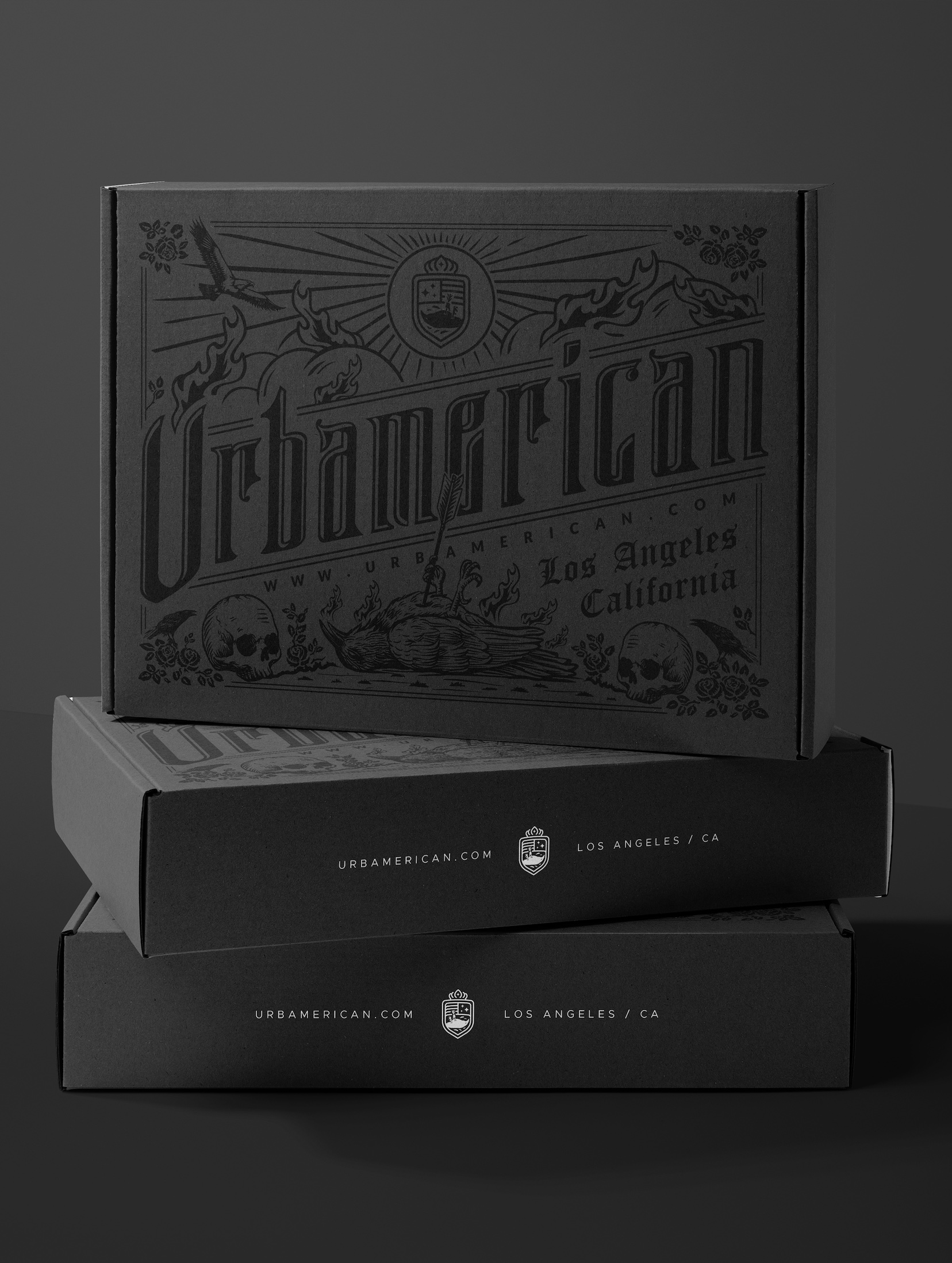
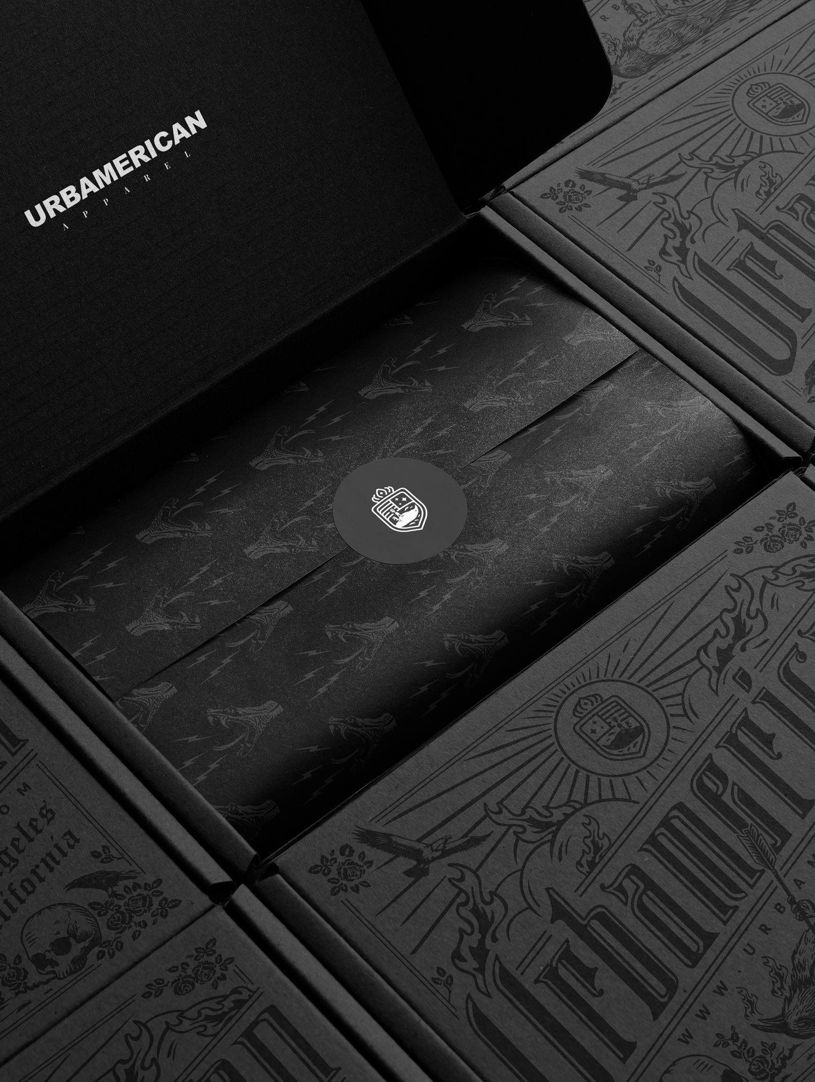
Bringing Rebel Spirit to Life
My challenge was to create packaging that didn’t just sit on a shelf — it had to shout. For Urbamerican, a raw and unapologetic rock brand, the goal was to translate its attitude into a tactile experience that fans could feel before they even opened the box.
The objective? Craft a visual identity for the packaging that screamed authenticity, edge, and underground appeal — while still being clear, practical, and production-ready. It needed to attract the right crowd and communicate the brand’s rebel spirit in an instant.
We found that Urbamerican’s audience wasn’t looking for polished perfection — they wanted grit, soul, and storytelling. So we fused bold typography, distressed textures, and punchy details with smart structure and functionality. Every element had a purpose, from the fold to the finish.
The result was packaging that looked like it came straight from the back of a garage show and felt like something worth keeping. Striking, loud, and proudly offbeat — just like Urbamerican.